
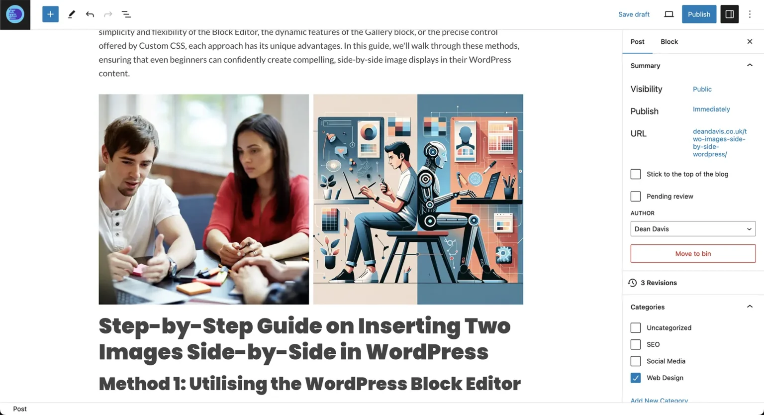
In the dynamic world of WordPress, arranging two images side by side isn’t just about aesthetics; it’s a powerful way to enhance your message and engage your audience. This layout can make comparisons clearer, showcase before-and-after scenarios, or simply break the monotony of text-heavy pages.
Luckily, WordPress Gutenberg users have multiple methods at their disposal to achieve this visually appealing configuration. Whether it’s the simplicity of the Block Editor, the dynamic features of the Gallery block, or the precise control offered by Custom CSS, each approach has its unique advantages. In this guide, we’ll walk through each method step by step.
1Method 1: Utilising the WordPress Columns Block
To put images side by side using the standard Gutenberg Block Editor:
- Add a Columns Block: Click the “+” block inserter and choose the Columns block. Select the 50/50 two-column layout.
- Insert Images: Click the “+” inside each column and add an Image block to each side, uploading from your device or media library.
- Adjust Column Widths: Fine-tune the width of each column via block settings if you want custom ratios (like 60/40).
- Align Images: Set alignment to centre or stretch to ensure consistent heights and tidy margins.
- Save and Publish: Preview on mobile and publish your post.
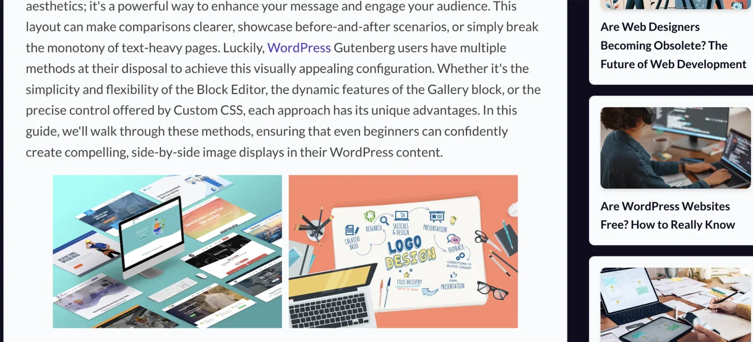
This method is straightforward, requires zero third-party plugins, and produces mobile-responsive columns out of the box.
2Method 2: Leveraging the Gallery Block
The built-in Gallery block is ideal for dynamic grid formatting and automatic cropping:
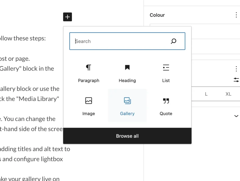
- Insert the Gallery Block: Click “+” and select Gallery.
- Upload Images: Select two images from your Media Library.
- Set Columns to 2: In the right-hand Block Settings panel, set the column count slider to 2.
- Add Alt Text & Captions: Ensure descriptive alt text is set for SEO best practices.
- Enable Lightbox (Optional): Allow visitors to click images to view high-resolution full-screen popups.
3Method 3: Employing Custom CSS Styling
For advanced developers who want exact layout control, using modern CSS Flexbox in your theme stylesheet or customizer provides pixel-perfect results:
/* CSS Flexbox for Side-by-Side Images */
.side-by-side-container {
  display: flex;
  gap: 1.5rem;
  justify-content: space-between;
  align-items: center;
}

.side-by-side-container img {
  width: 100%;
  height: auto;
  border-radius: 1rem;
}

@media (max-width: 768px) {
  .side-by-side-container {
    flex-direction: column;
  }
}
Wrap your images inside an HTML block using <div class="side-by-side-container"> to achieve seamless alignment that collapses neatly on mobile.
Advantages of Side-by-Side Visuals
Clear Comparisons
Ideal for before/after client case studies, product variants, and feature tables.
Engaging Content Flow
Breaks up long blocks of text to keep readers engaged and decrease bounce rates.
Accessibility Best Practices
- ✓ Descriptive Alt Text: Always specify concise alt text so screen readers can interpret the comparison.
- ✓ Figure & Figcaption: Use semantic captions when images need context or explanatory notes.
- ✓ Mobile Responsiveness: Ensure images stack vertically on phones so text remains legible and images don't overflow.